
Compact Entity List
GOAL: display information in a more compact way. This is functional information.
By default Home Assistant likes to use a lot of space. Sometimes, you don’t have a lot of space, especially on mobile devices. And sometimes, information is functional without any need to look good. (even though I don’t think stuff looks better when you spread it across a larger space :-) )
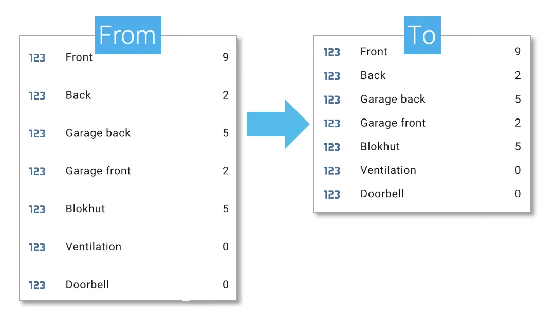
The right example below is compact and shows exactly what it should show in a smaller space.
How?
Using the card-mod plugin (community discussion). Easiest way to install? via HACS.
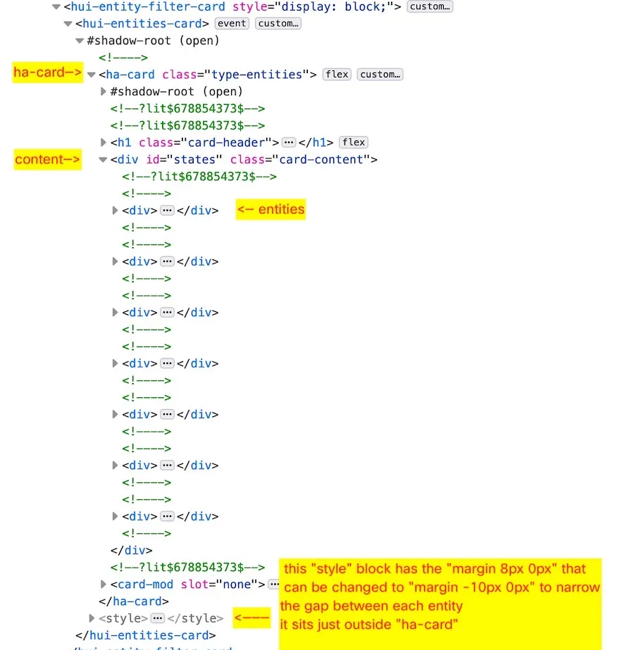
After hacking around in the page source throught the browser inspector I found what needed to be changed: The “margin -10px 0px;” that I need to modify is in the “style” block AFTER the ha-card block.
Yaml code:
type: entity-filter
entities:
  - entity: counter.frontdoor
    name: Front
  - entity: counter.backdoor
    name: Back
  - entity: counter.garageback
    name: Garage back
  - entity: counter.garagefront
    name: Garage front
  - entity: counter.blokhut
    name: Blokhut
  - entity: counter.ventilation
    name: Ventilation
  - entity: counter.doorbell
    name: Doorbell
state_filter:
  - operator: '>='
    value: 0
card:
  type: entities
  title: Counter-->below-->card-mod config!
  card_mod:
    style:
      .: |
        ha-card div#states div {
        margin-top: -10px !important;
        margin-bottom: -10px !important;
        }
The issue I had at first was that the “card_mod” section was at the ‘root’ of the yaml. When I indented that section with 2 spaces it belonged to the “card:” section and it instantly worked!
(you can also combine this with removing Entity Icons described in another post)
Enjoy!